| Have you ever wanted to enter your home and find yourself in a tranquil, calming environment free of worries? Me too — but it's not always that easy to relax in our homes. Maybe your children have made a mess while you were away, or you've piled up some dishes and laundry because you're busy working all day. The stresses of daily life can get to us and make it harder to keep our home clean and organised, leaving us feeling anxious and unsatisfied. But what if it were easier to feel instantly calmed by your own home? Using a calming colour palette is an easy way to curate a better home environment, so that by walking in the door, you'll be invited to relax and unwind. Cool colours like blues, purples, and greens can achieve this sort of effect. And by using a majority of calming colours, you'll find that you won't always need everything to be perfect in order to feel calm. 1. All about blue 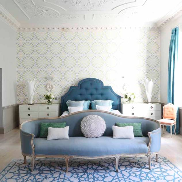 Blue is the colour that comes to mind for most of us when we think of calm. Soothe your soul by adding pops of blue to your bedroom. 2. Golden glow 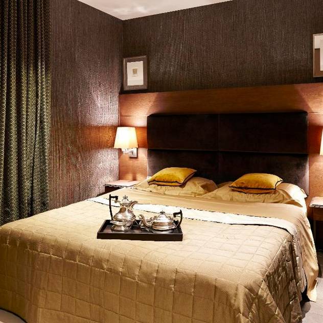 Warm colours can relax us too — think mustards, deep greens, and rustic reds or browns. These colours look very gentle in this bedroom, and it might be nice to dim the lights for ultimate relaxation. 3. Lovely earth tones 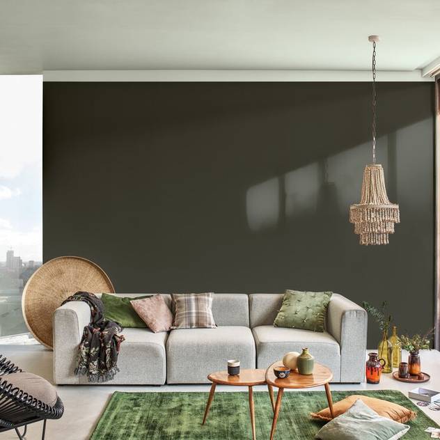 Earth tones are a go-to for a calming colour palette. Use vibrant greens, dull olives, and pale blues or greys for a lovely escape in your living room. 4. Neutral nest 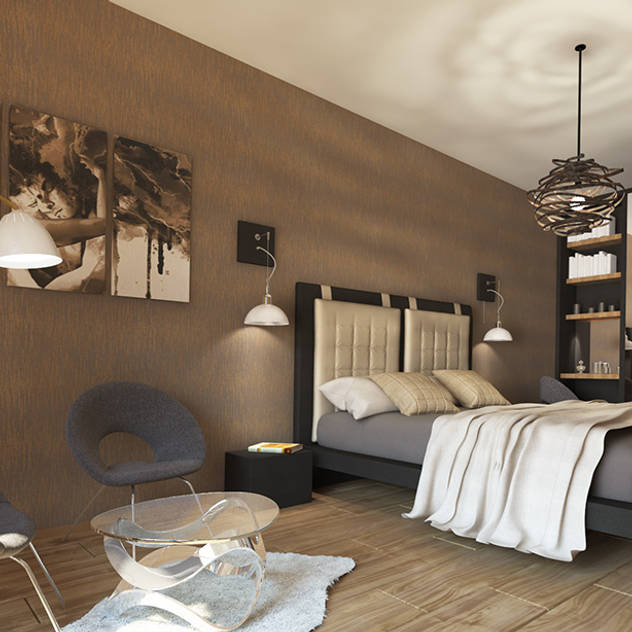 Sometimes the most soothing tones are barely there colours like beige, grey, and white. Consider using neutral notes to keep a room from feeling too busy. 5. Moody luxe 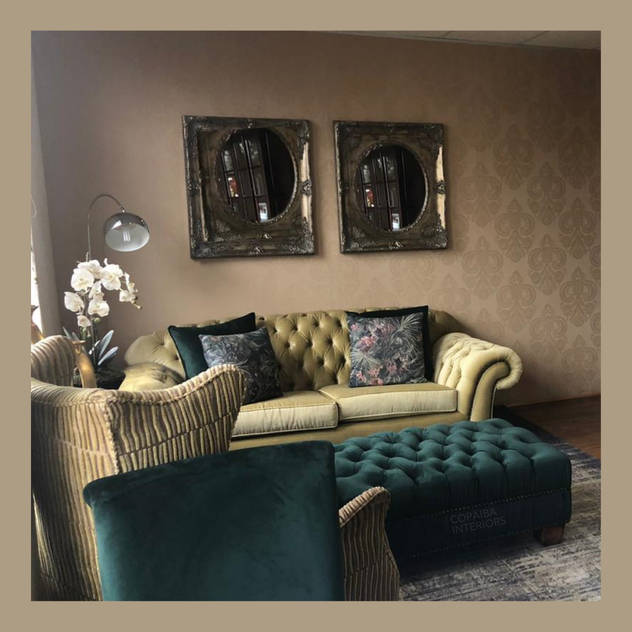 Sometimes setting the mood and dimming the lights of a room can make for instant calm — do add pleasant shades of green and beige tones and let in natural light, but don't add too much artificial light. Luxe fabrics look rich and comfortable. 6. Pick pastels 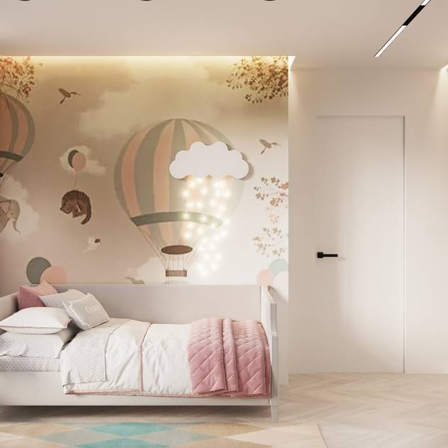 Especially for children's rooms, pastels are a brilliant choice if you want to create a soothing environment. Pinks and muted greens go great together, but purples, blues, and yellows could look nice as well. 7. Seafoam blue 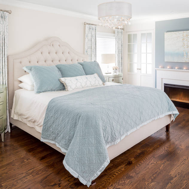 There's no better colour for a relaxing room than the colour of the sea meeting the beach. Seafoam is a great colour because it's a pale blue with reflections of grey or green. It looks great with almost any palette, but looks especially charming in this all-white room. |
|
8. Warm relaxation  Warm colours look great in this room, and the light wood flooring and spare furniture is actually very relaxing without trying too hard. You could recreate a similar look with an interior designer or by adding subtle pops of colour in a neutral-toned room. 9. Creamy kitchen 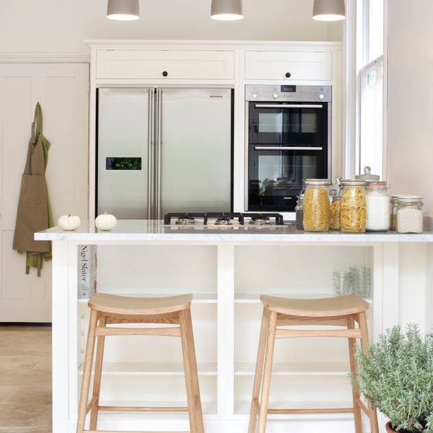 We love the look of a white or cream kitchen, which looks fabulously open and well-lit. With the addition of plants for a pop of green, we can imagine that breakfast, lunch, and dinner would be quite the vacation. 10. Gold and white tones 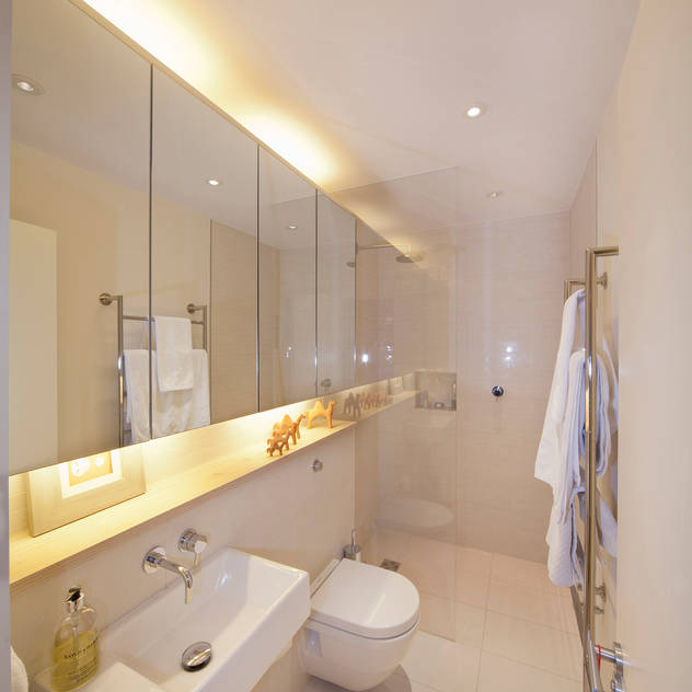 Sometimes the simplest of palettes can be the most calming, and this bathroom is no exception. We don't need too much detail in a bathroom — using a pop of gold or just keeping the room cream or white is pleasing to the eye. 11. Artsy mustard 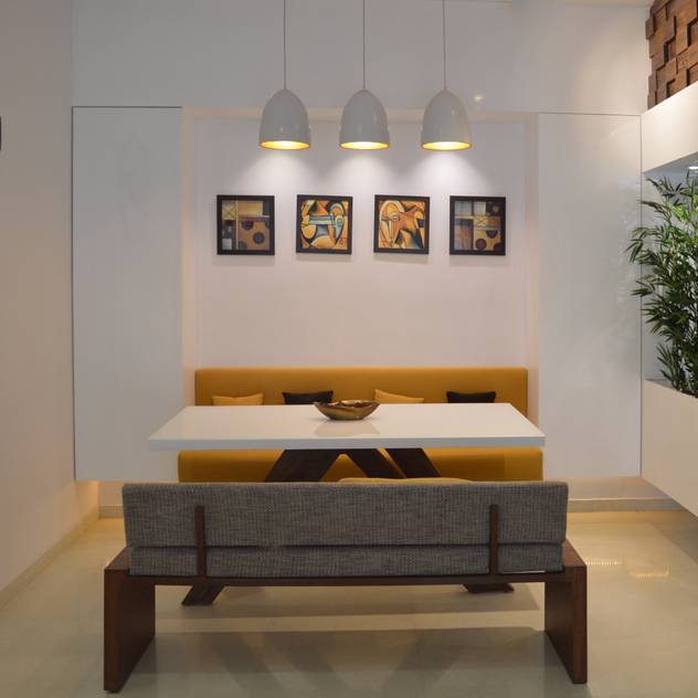 Again, mustard is a great choice for a sense of calm. Here, the furniture is sparse and, with the matching tones in the artwork and the green plant, the effect is lovely and subtle. 12. Blue-grey island  How unexpected and fun is this blue-grey kitchen island? It looks exceptional against the otherwise neutral palette of the kitchen, and using such a pop of colour is a great way to add a soothing tone to a room. 13. Beige and bright 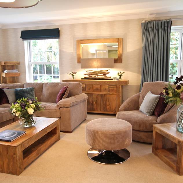 This living room is a little more chaotic than other rooms we've seen, but it maintains a sense of relaxation. How? The colour palette is simple and incorporates lots of warm wood tones, beige, and a pop of blue-grey. 14. Work with neutrals 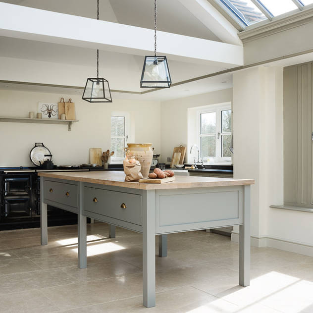 If you're not a fan of too much colour, don't be afraid to keep a room neutral. This room uses various tones — the black counter in the back, the grey and light wood table, the white walls. 15. Grey away 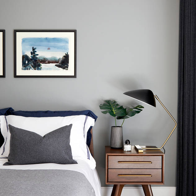 Grey is an overlooked colour for its simplicity — it can truly transform a room into a calming space when used in the right way. Here, various tones of grey with pops of white and black looks lovely, but the added pops of blue in the photos and green from the plant remind us of holidays. Courtesy of Emma Haggarty of Homify
|
| Need more information? Fill in the form below and we will contact you! |
| |